Aseer Winter Campaign
A social-media system for Aseer's winter tourism season — a graphic language built to carry four destination themes across three post formats, without ever repeating itself.


Winter transforms Aseer — but a destination this layered needs a social system that can move with it. We built one: a modular graphic language across three post formats — main campaign posts with bold geometry, regular posts with winter overlays, and caption-led photography that lets the place speak. Each of four destination themes carries its own colour palette inside a single brand language, so every scroll past the feed adds to the season's story without breaking it.
- Social Media Strategy
- Creative Concept
- Visual System Design
- Art Direction
A graphic language for the season.
The campaign turns on a graphic language built around movement, discovery, and seasonal change. A modular geometric system — bold shapes in thematic colour — carries the season across every post format without ever repeating itself. The system isn't decoration; each shape signals the experience type the post is about.
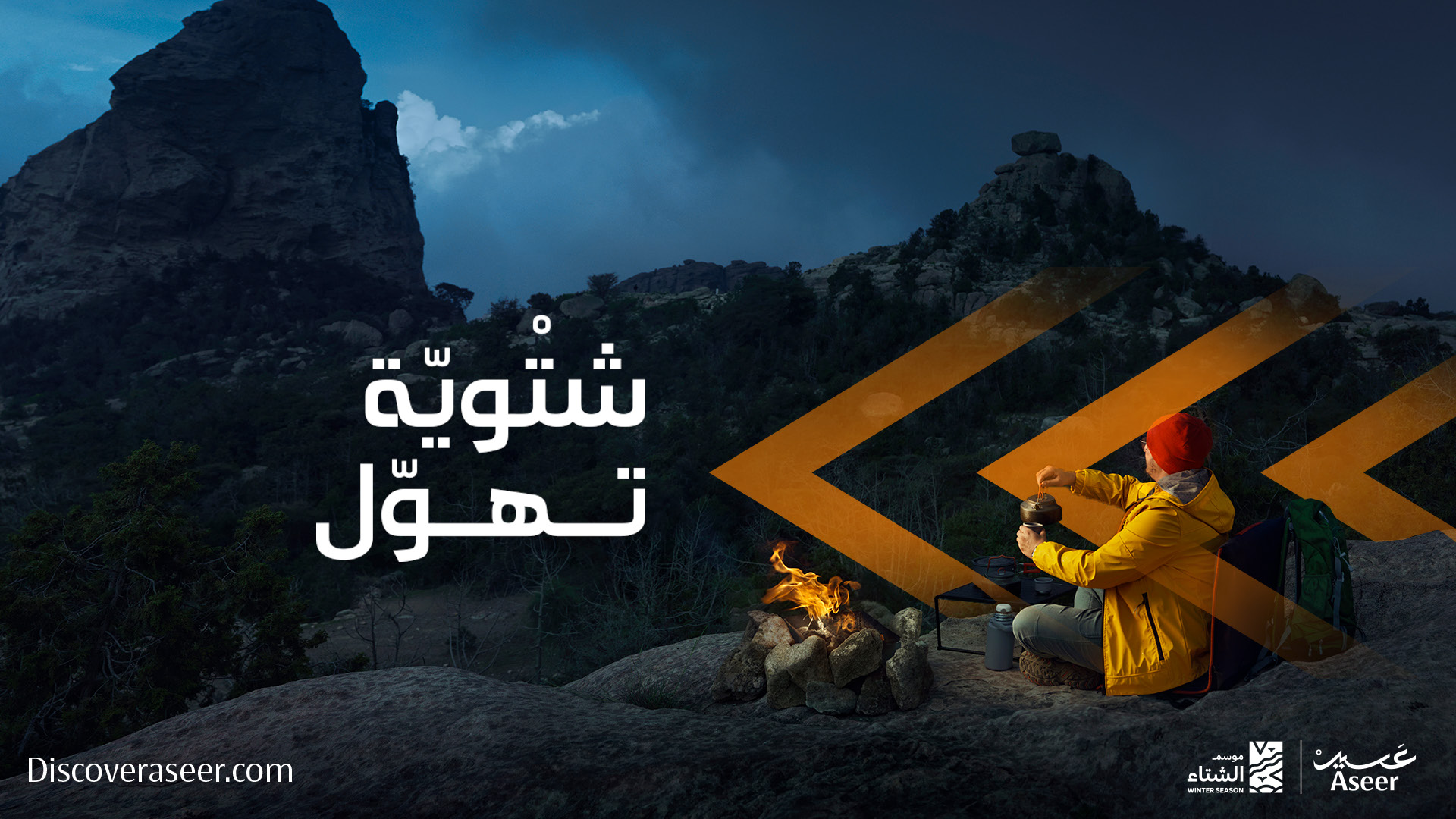
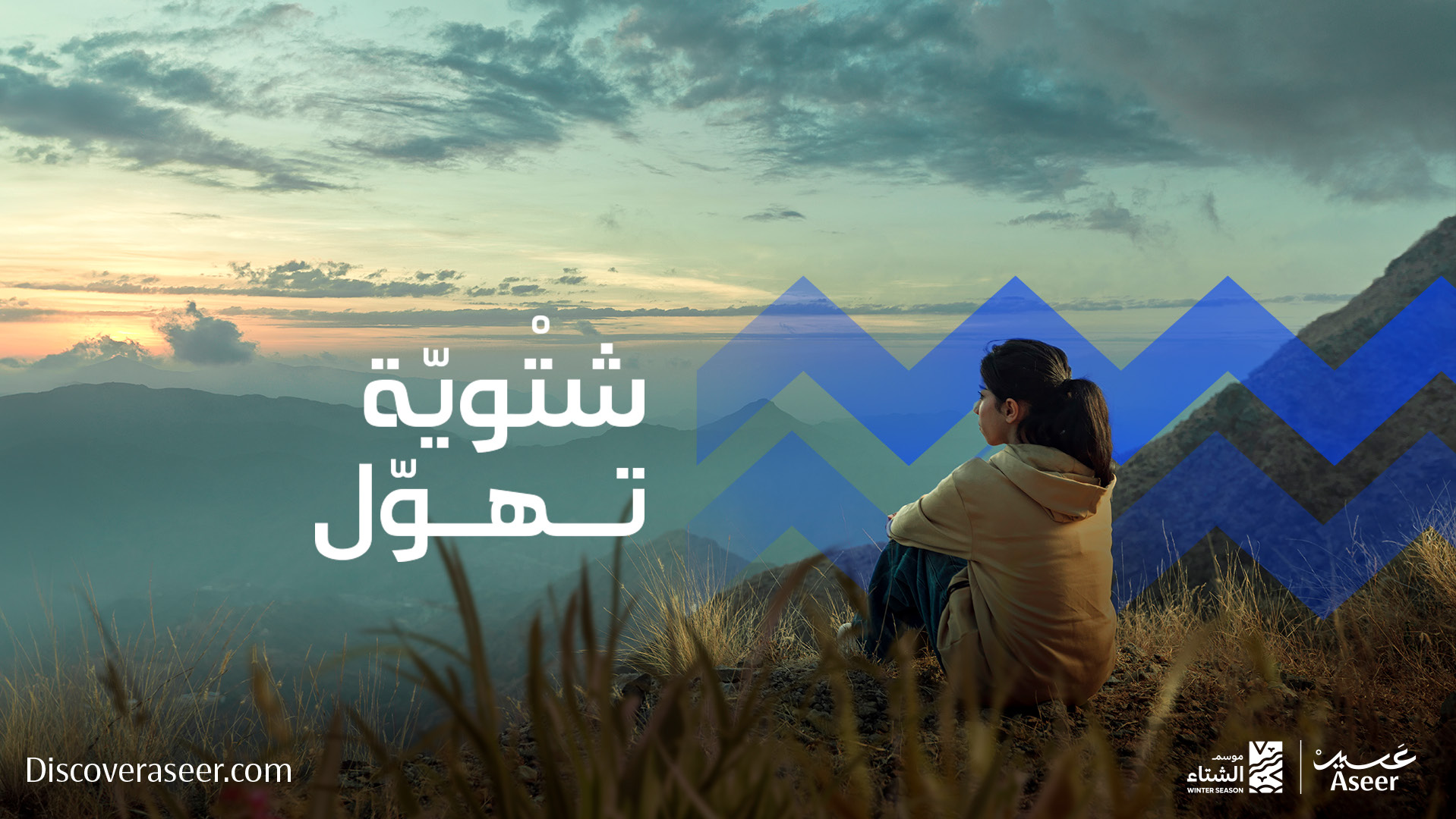
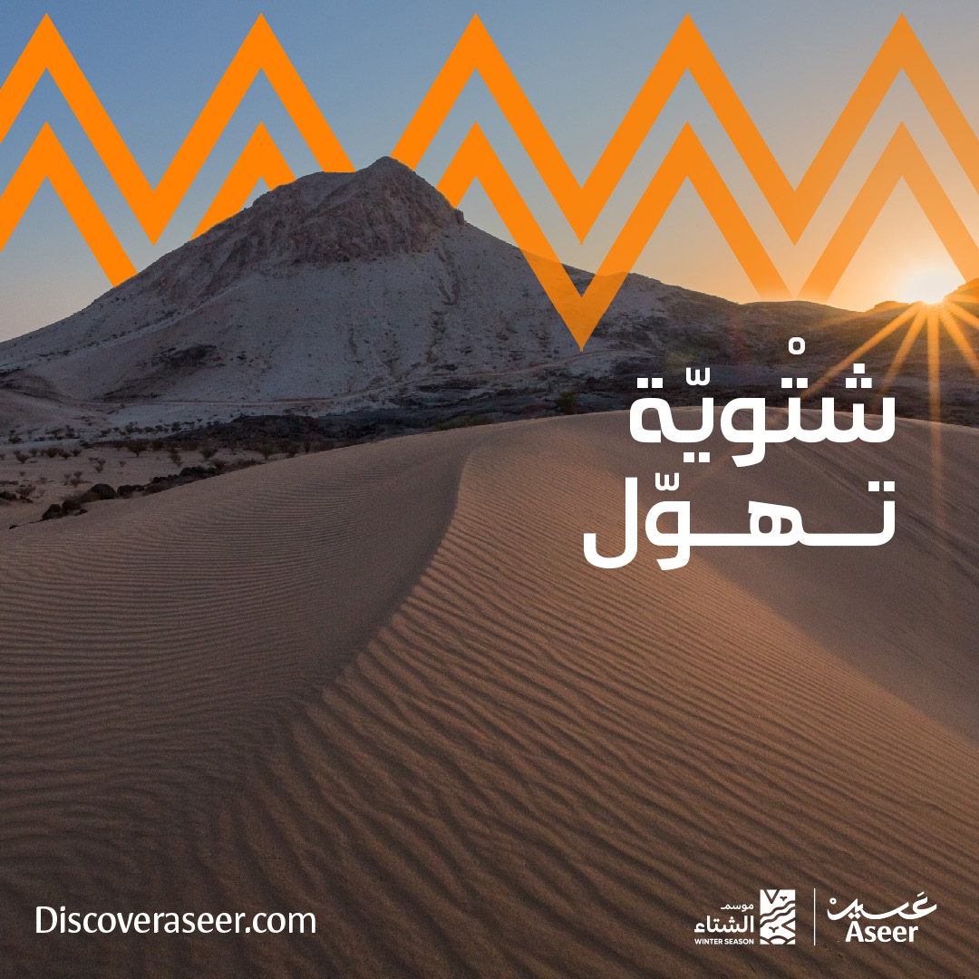
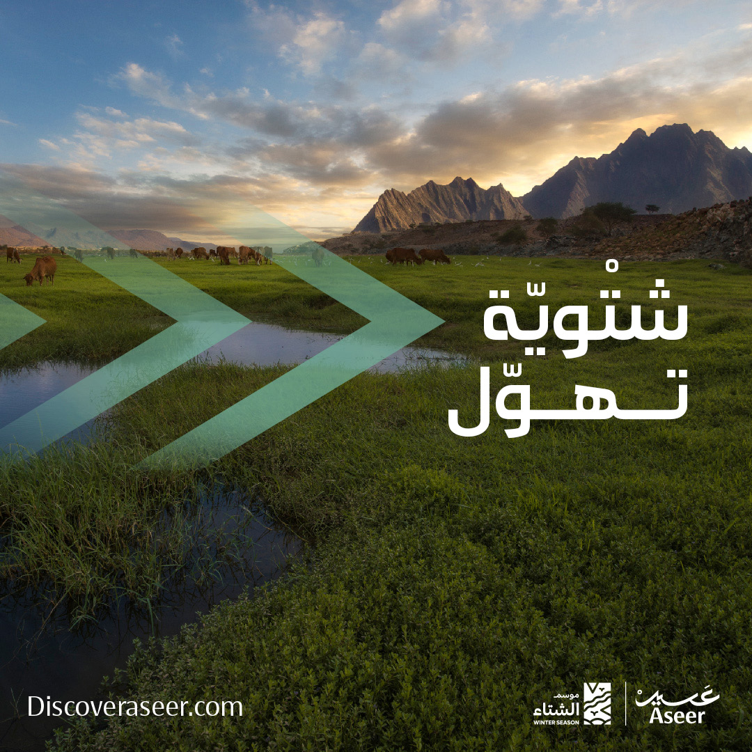
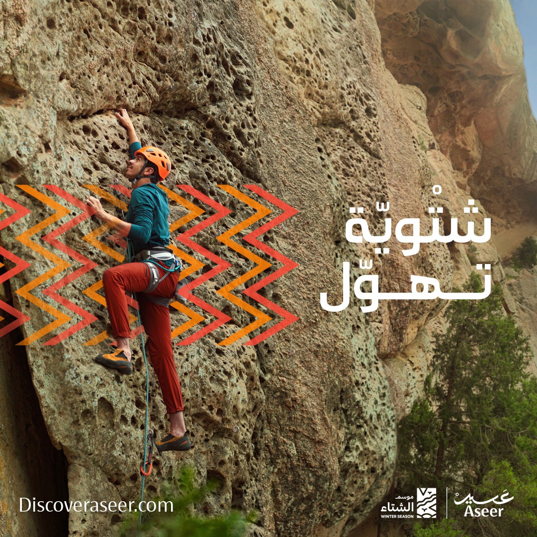
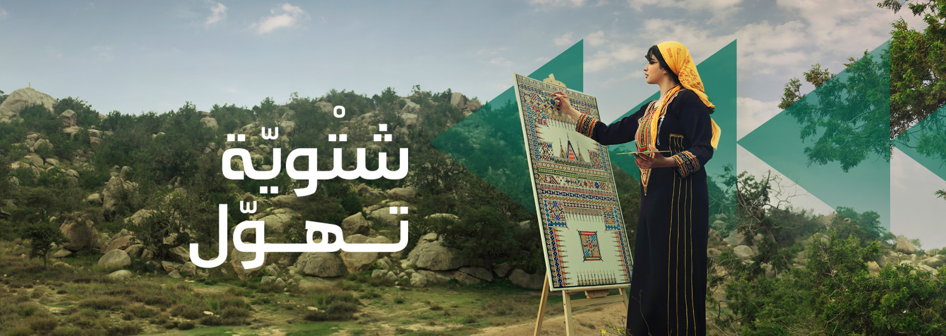
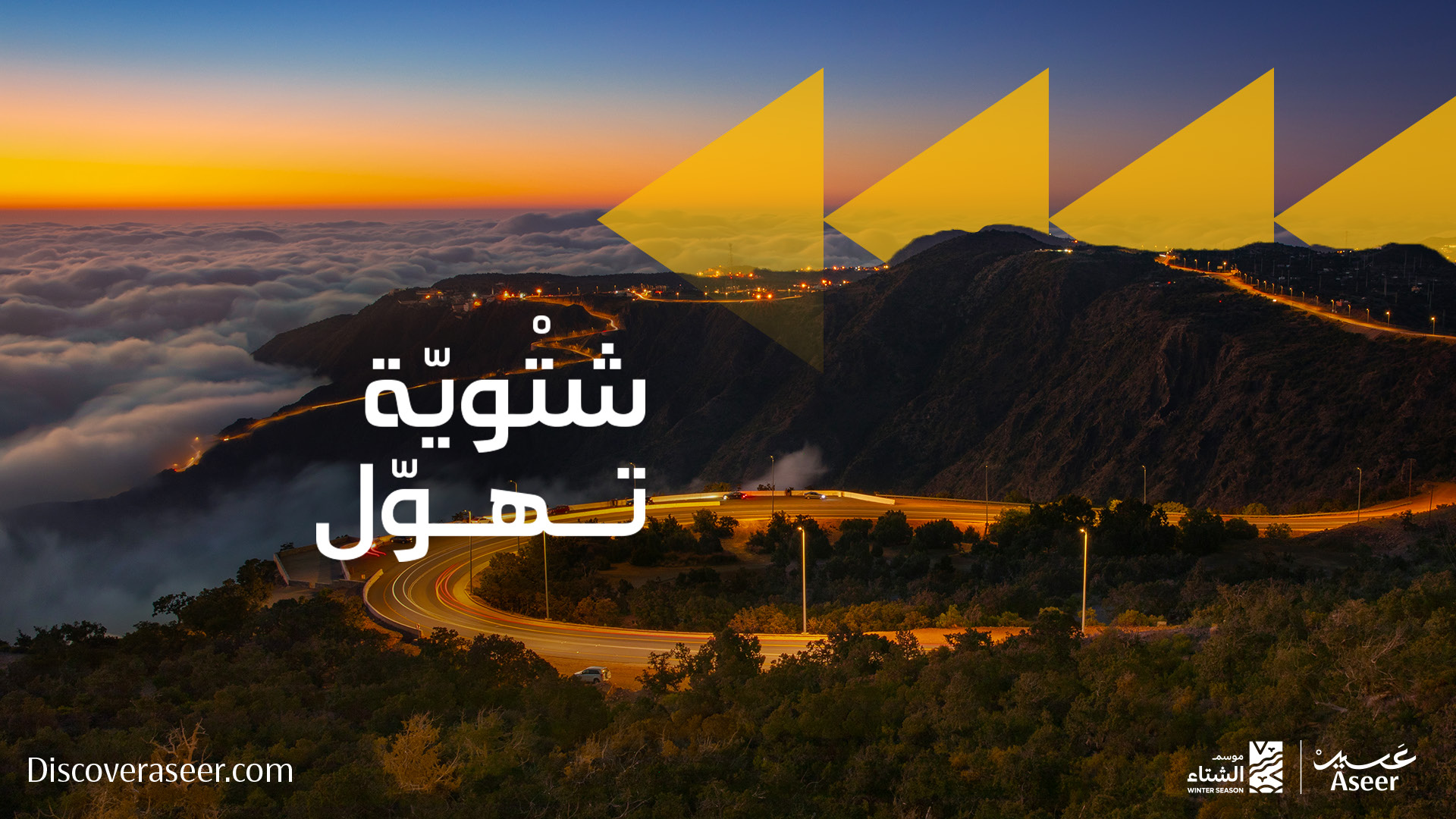
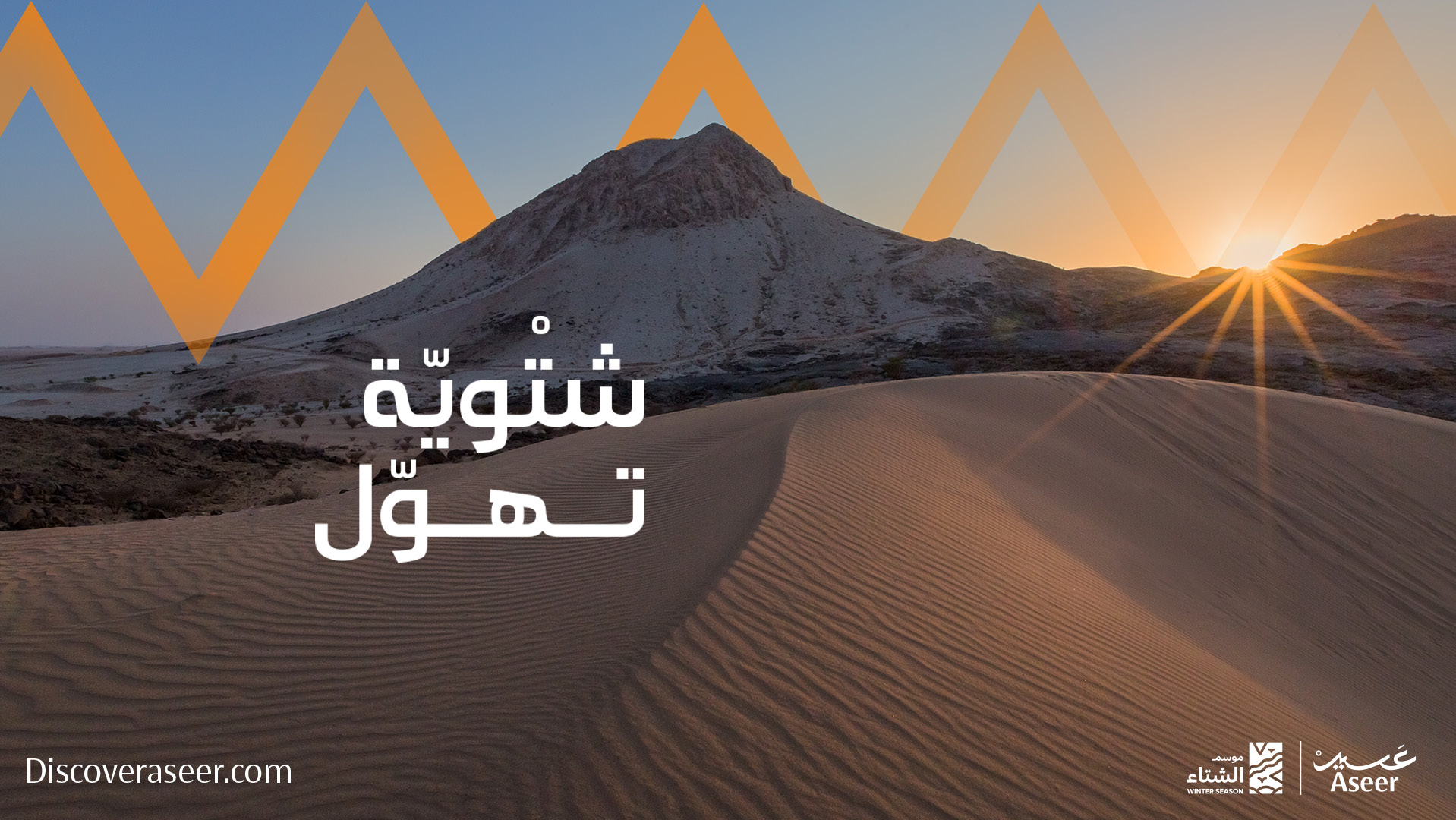
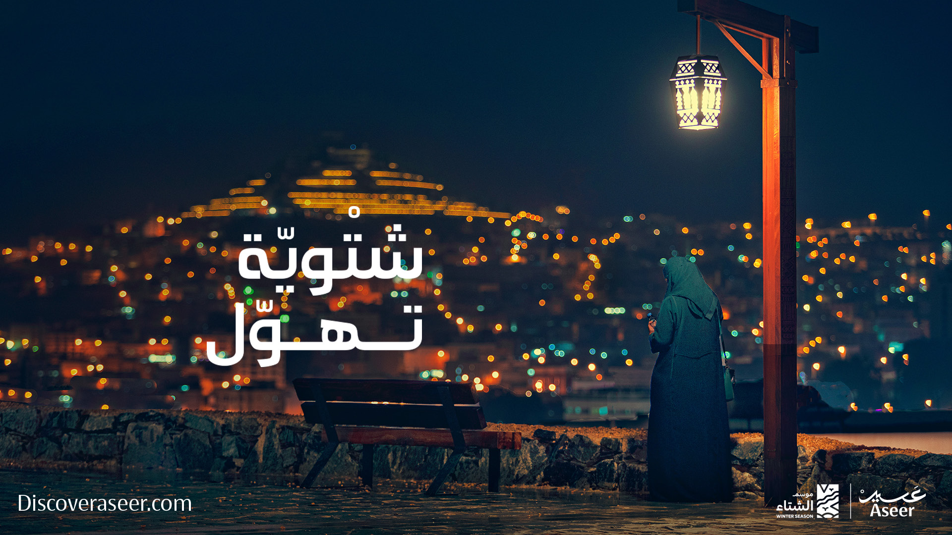
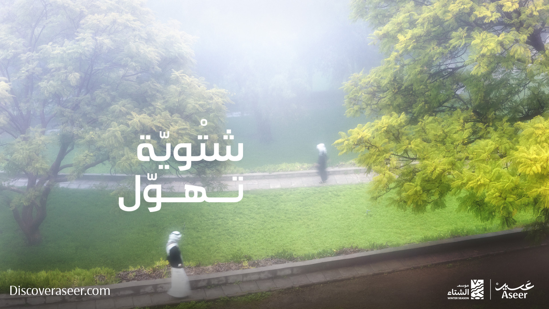
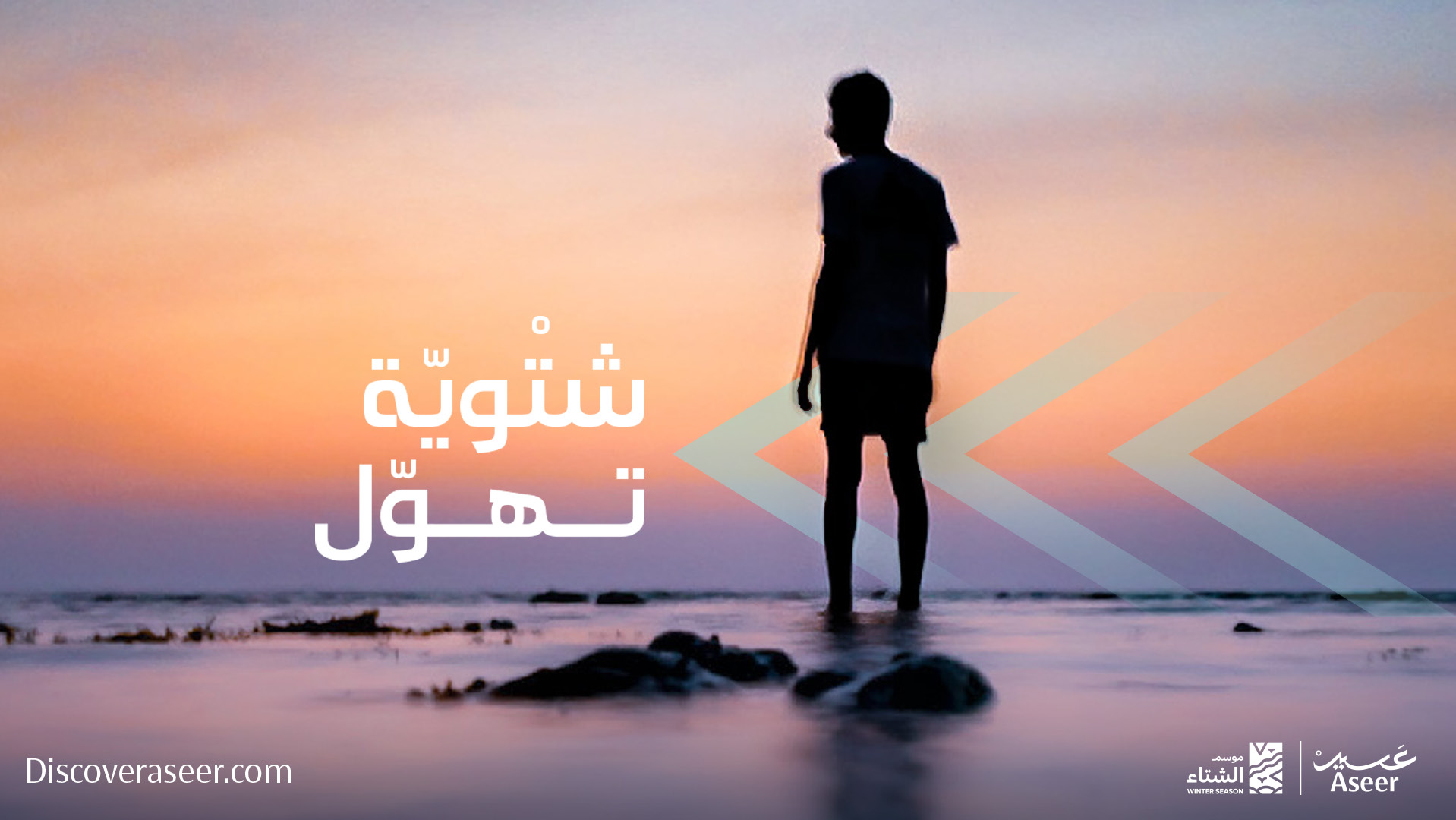
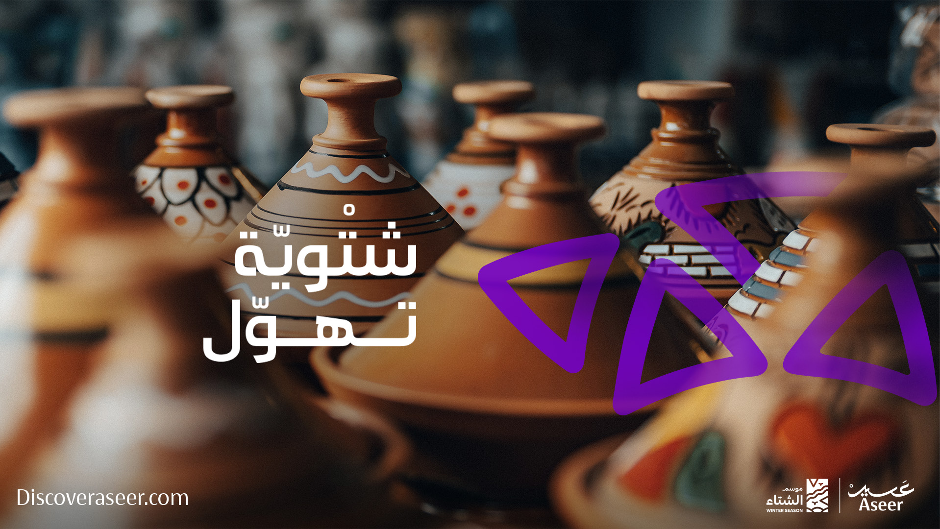
Four destinations, four palettes.
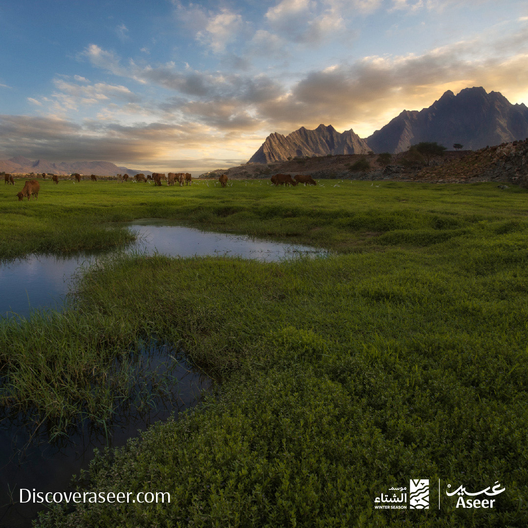
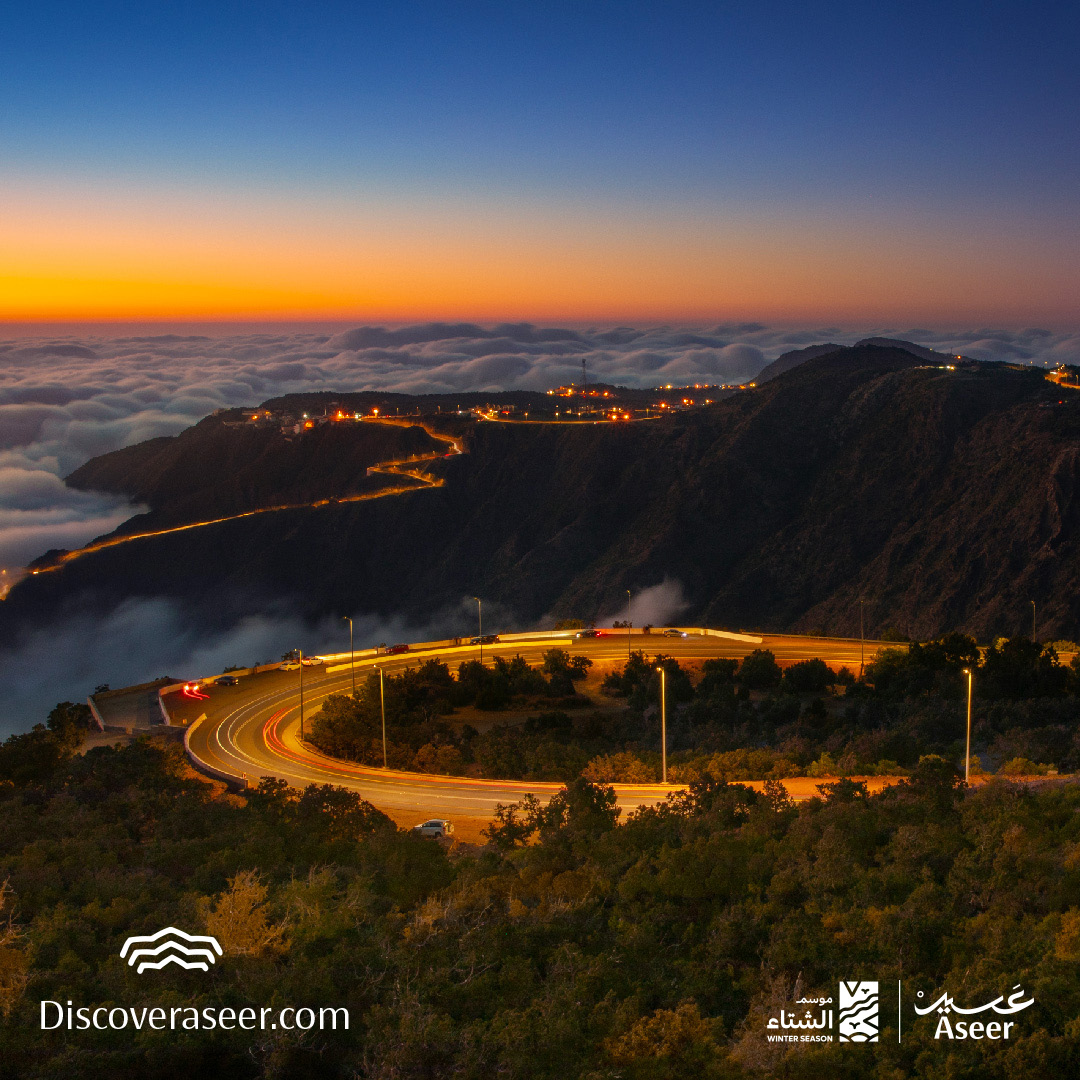
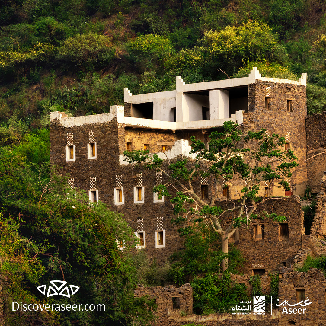
Aseer isn't a single destination — it's four. We mapped each winter experience to its own visual identity: Blue Coast in serene coastal tones and flowing chevrons; Emerald Peaks layered in mountain blues; Living Museum in heritage imagery and teal triangles; Desert Getaway in bold orange chevrons against gold. Each palette is instantly recognisable — so a traveller scrolling the feed can navigate Aseer's diversity by colour alone.

One system, three voices.
Three post formats, one graphic language, one strategic message. Main posts drive awareness; regular posts with winter overlays carry the ongoing beat; caption-led photography lets the place speak for itself. Together they make a feed that stays fresh without going off-script.

Design that works as hard as the copy.
Every element earns its space. The chevrons and triangles aren't decoration — they're directional, guiding the eye and signalling movement. The colour-coding turns a feed scroll into a wayfinding system. The pattern anchored at the bottom-left of every post means even a two-second glimpse reads as part of the campaign. This is design pulling its weight beside the copy.

One season. Infinite moments.
Winter in Aseer arrives differently for every traveller. We built a social system to hold that multiplicity — across platforms, formats, and themes — without ever sounding like four different brands. The feed reads intimate and expansive at once, by design.