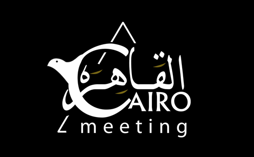
Cairo Meeting
A peace dove, in two scripts.
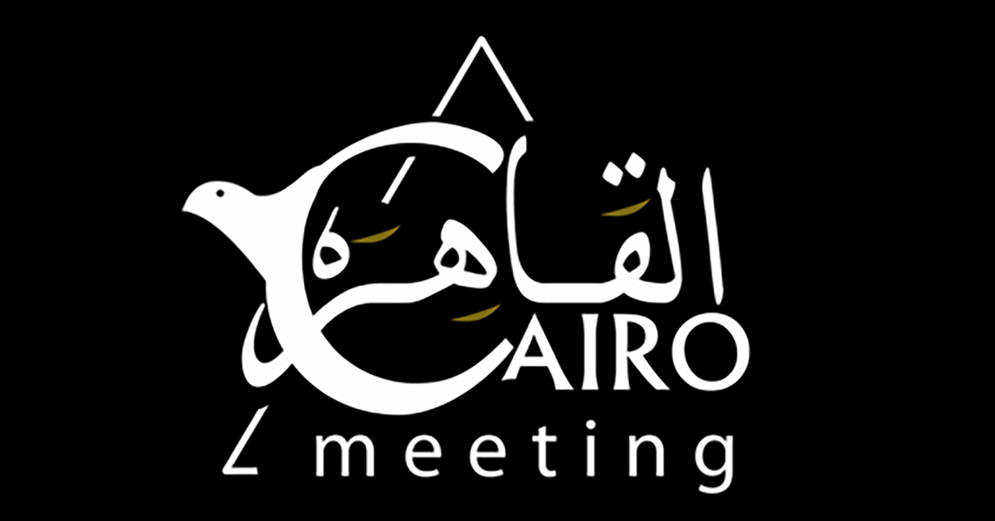
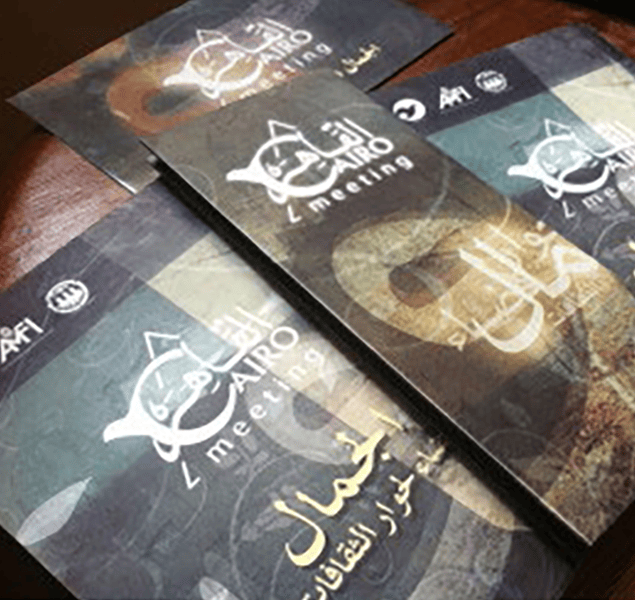
We led brand strategy, identity, and the conference materials for Cairo Meeting. The mark is a bilingual lockup: a peace dove drawn into the C of CAIRO, and again into the ق of القاهرة, one image read two ways. The event design carries the same restraint: gold ink on black, calligraphy left to do the talking, a stage that feels like a conversation worth having.
- Brand Strategy
- Bilingual Identity Design
- Event Branding
- Print Materials
One mark, two scripts, one dove.
We built the identity around a single bilingual gesture. The dove takes flight out of the C in CAIRO, and out of the ق in القاهرة. Two scripts, one image, one promise: a meeting worth crossing a language for.
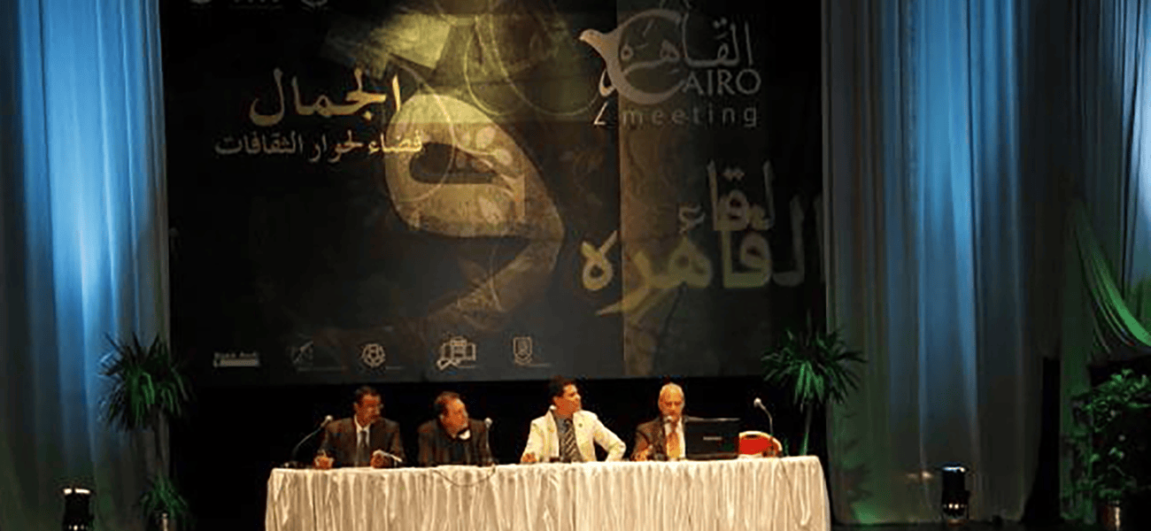
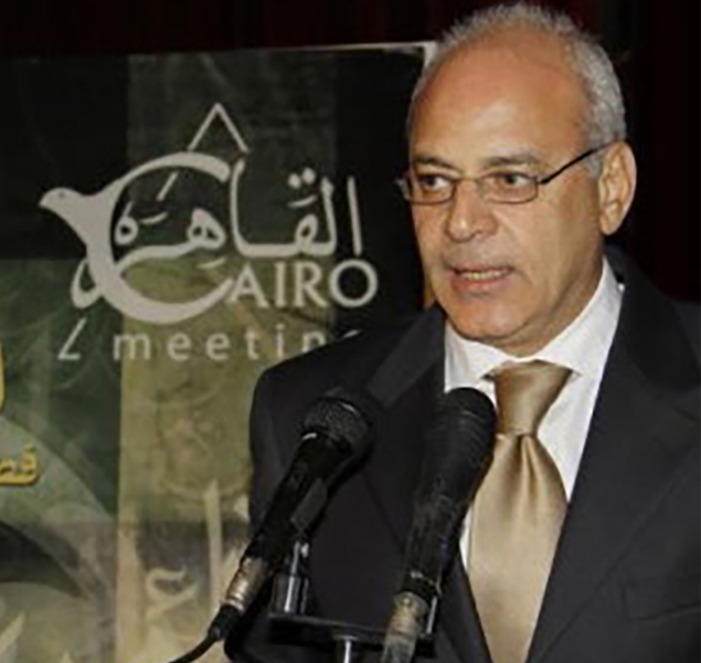
In the room, on the page.
The system carried into the stage, the speaker's podium, and the printed programme. Gold over black, calligraphy doing the talking, a conference that looked like a conversation worth having.